Photograph by Jasper DiSanto
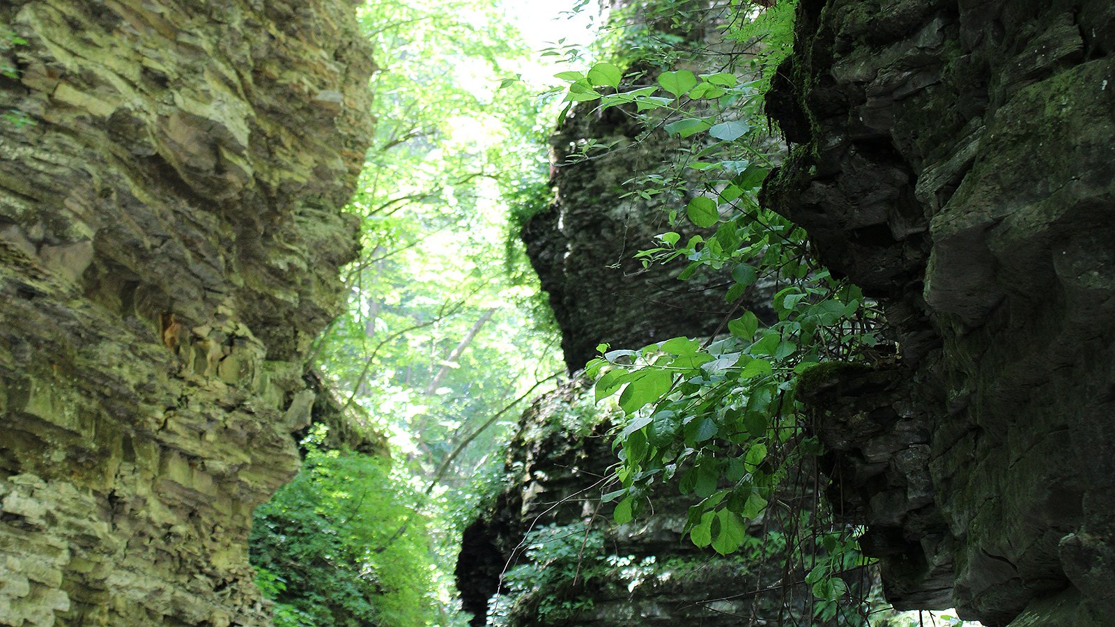
This photograph is my work. Layered rock walls and green foliage surround a bright opening in a wooded gorge. It is a useful image to study because the scene offers more than one place to look: the dark stone on the right, the softer wall on the left, and the leaves reaching into the space between them.
Looking at the finished photograph, three elements stand out: texture, depth and contrast. Each offers a different way to think about composition.
Let texture carry part of the picture
The rock faces give the photograph much of its structure. Horizontal layers run across the walls, while cracks and uneven edges break those lines into smaller shapes. The leaves offer a contrasting surface: lighter, smoother and more delicate against the stone.
For a composition study, compare those surfaces before thinking about the whole scene. Where is the texture easiest to read? Where does it disappear into shadow? A photograph can hold attention through these small differences even when there is no single isolated subject.
Look for depth between the layers
The leaves on the right sit in front of the rock. Beyond them, the brighter opening creates another layer. That overlap helps the image read as a space rather than a flat pattern.
A useful exercise is to trace the picture from near to far. Start with the leaves, move to the wall behind them, and then look toward the opening. Notice how the edges of one element interrupt another. Those interruptions give the viewer clues about their relationship.
Notice where the light pulls your attention
The bright area near the top and center competes with the darker rock for attention. Some of those highlights appear close to white in this web version, while the right wall contains deep shadows.
That makes the image useful for discussing a tradeoff: brightness can guide the eye, but it can also draw attention away from texture. When reviewing a photograph, ask whether the brightest part supports the subject you want the viewer to notice. If it does not, compare a different framing or a restrained edit of the original file. Check the result rather than assuming an adjustment will recover detail.
Try this with one of your photographs
Choose a landscape image and name three things: its strongest texture, its nearest visible layer, and its brightest area. Then ask whether those elements work together or compete.
You do not need to reconstruct every camera setting to learn from a finished photograph. Careful observation can reveal what the picture communicates now—and suggest what to pay attention to next time.
What catches your eye first here: the rock, the leaves or the light?
Sources & Field Notes
Photograph by Jasper DiSanto, supplied for this article. This study is based on the visible composition of the finished photograph. Capture location, date, camera settings and field conditions are not documented here.
For another look at framing, light and the limits of a finished image, explore the one-lens photo-walk story.